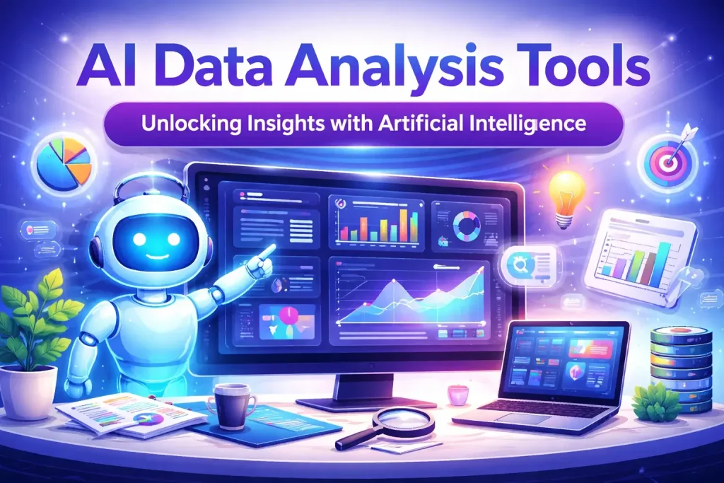
Data Analysis Tools (2026 Guide) – Turn Raw Data Into Real Insights
Let’s be real for a moment. Data is everywhere—spreadsheets, databases, analytics platforms, customer records. But raw data by itself? It’s just noise. The magic happens when you actually understand what it’s telling you.
That’s where data analysis tools come in. Whether you’re a small business owner trying to understand sales trends, a marketer tracking campaign performance, or a data scientist building predictive models, the right tools make all the difference between guessing and knowing.
In this guide, I’ll walk you through the best data analysis tools in 2026—from beginner-friendly spreadsheets to powerful AI-powered platforms. No jargon, no fluff. Just honest, practical advice to help you choose what actually works for your situation.
What Exactly Are Data Analysis Tools?
At their core, data analysis tools help you clean, organize, and interpret data efficiently. Think of them as your translator—they take raw numbers and turn them into insights you can actually use.
Here’s what good data analysis tools do:
- Clean your data: Remove duplicates, fix formatting, and handle missing values automatically
- Organize information: Structure data so you can actually work with it
- Spot patterns: Identify trends you’d never see scrolling through rows of numbers
- Create visualizations: Turn boring spreadsheets into charts that tell a story
- Make predictions: Help you forecast what might happen next
The right tool depends entirely on your situation—how much data you have, what you’re trying to learn, and how technical you want to get.
Why People Are Investing in Better Data Tools
I’ve talked to dozens of professionals who’ve upgraded their data game. Here’s what they actually notice:
- They stop guessing: “I used to make decisions based on gut feel. Now I actually know what’s working.”
- They save hours every week: Manual spreadsheet work that used to take all Friday afternoon now happens automatically.
- They spot problems earlier: Dashboards show when something’s off before it becomes a crisis.
- They communicate better: Visuals help everyone understand the story the data is telling.
- They actually enjoy the work: When you’re not fighting with tools, analysis becomes interesting instead of exhausting.
One marketing manager told me, “I spent years exporting reports from five different platforms and stitching them together in Excel. Now I have a dashboard that updates itself. I literally got hours of my life back.”
The Best Data Analysis Tools in 2026
After testing and researching the major players, here’s my honest take on the top tools this year.
Microsoft Excel – Best for Beginners and Small Businesses
Who it’s for: Pretty much everyone starting, plus countless businesses that never outgrow it.
Excel is the tool everyone loves to hate, but here’s the truth—it’s everywhere for a reason. Formulas work predictably, pivot tables let you summarize data in seconds, and charting gives you basic visuals without a learning curve.
The truth: Excel handles about 80% of what most people need. If you’re just getting started, master pivot tables and VLOOKUPs before buying anything fancy. You might not need more.
Google Data Studio (Now Looker Studio) – Best for Free, Real-Time Dashboards
Who it’s for: Teams that want live dashboards without spending money.
Google Data Studio connects to practically everything—Google Analytics, Google Sheets, BigQuery, plus hundreds of other data sources. You build interactive dashboards that update automatically as new data comes in.
The truth: The price is right (free!), and it’s surprisingly powerful for reporting. The learning curve is gentle, and you can share dashboards with anyone. Major win for small teams.
Tableau – Best for Advanced Visual Analytics
Who it’s for: Organizations where data visualization is central to decision-making.
Tableau is the Ferrari of data visualization. Drag and drop your way to stunning interactive dashboards. Explore data from every angle. Find insights you’d never spot in static reports.
The truth: It’s expensive and takes time to learn, but for serious analytics work, nothing else creates visuals that communicate as powerfully. If your whole organization runs on data, Tableau is worth every penny.
Power BI – Best for Microsoft Ecosystem Integration
Who it’s for: Companies already living in Microsoft land.
Power BI integrates seamlessly with Excel, Office 365, and Azure. You get strong data modeling, beautiful reports, and collaboration features that make sharing insights easy.
The truth: It’s more affordable than Tableau and does 90% of what Tableau does. If your team already uses Microsoft tools, this is the obvious choice. The learning curve is real but manageable.
R – Best for Statistical and Academic Analysis
Who it’s for: Researchers, statisticians, and anyone doing heavy statistical work.
R is an open-source programming language built by statisticians for statisticians. Thousands of packages exist for every imaginable statistical test, visualization, and modeling technique.
The truth: The learning curve is steep—you’re learning to code. But for specialized statistical work, nothing beats R’s depth and flexibility. And it’s free, which academics appreciate.
Python (Pandas, NumPy, Matplotlib) – Best for Flexible Data Science
Who it’s for: Data scientists, analysts who need automation, and anyone building machine learning models.
Python has become the universal language of data science. Pandas handles data manipulation like a dream. NumPy does mathematical heavy lifting. Matplotlib creates visualizations. And that’s just the beginning—machine learning, automation, web scraping, you name it.
The truth: Python does everything, but you have to learn to code. For recurring analysis, automation, or serious data science, it’s unbeatable. For one-off reports, Excel is probably faster.
Apache Spark – Best for Big Data Processing
Who it’s for: Organizations processing massive datasets that won’t fit in Excel or even a single database.
Spark is built for scale. It processes data across clusters of computers, handling terabytes or petabytes without breaking a sweat. Fast, distributed, and integrates with Hadoop and cloud platforms.
The truth: If you’re asking whether you need Spark, you probably don’t. This is for companies with serious big data infrastructure and teams of engineers to manage it.
Data Analysis Tools Compared: Which One Fits You?
Let’s put them side by side so you can see the differences at a glance:
| Tool | Best For | Core Features | Price | Learning Curve |
|---|---|---|---|---|
| Excel | Basic analysis, small business | Formulas, pivot tables, charts | $159.99 one-time or Office 365 sub | Easy |
| Google Data Studio | Free dashboards, reporting | Data connectors, real-time reports | Free | Easy |
| Tableau | Advanced visualization | Interactive dashboards, drag & drop | $70/user/month | Moderate |
| Power BI | Microsoft ecosystem | Data modeling, collaboration | $10/user/month | Moderate |
| R | Statistical analysis | Open-source libraries, visualization | Free | Advanced |
| Python | Data science, ML, automation | Pandas, NumPy, endless libraries | Free | Advanced |
| Apache Spark | Big data processing | Distributed computing, MLlib | Free (open-source) | Advanced |
Note: Prices are approximate as of 2026 and may vary based on region and contract terms.
How to Actually Use Data Analysis Tools Effectively
Having the tool is one thing. Using it well is another. Here’s what actually works:
Start With a Question, Not a Tool
Before opening anything, ask yourself: What am I trying to learn? What decision will this inform? Tools are just means to an end—if you don’t know the destination, any path will do, but you’ll waste time getting nowhere.
Clean Your Data First (Seriously, Do This)
Dirty data leads to wrong conclusions. Check for duplicates, fix inconsistent formatting, and handle missing values. It’s boring but essential. Every hour you spend cleaning saves three hours of chasing false insights later.
Visualize Before You Analyze
Make a quick chart of whatever you’re exploring. Patterns jump out visually that you’d miss when scanning numbers. Use Tableau, Power BI, or even Excel charts to see what’s actually happening before diving into statistics.
Automate Repetitive Work
If you run the same analysis every week, learn Python or R, and automate it. One analyst I know automated a 3-hour weekly report down to 15 minutes. That’s 120 hours a year, back—three whole work weeks.
Know When Spreadsheets Aren’t Enough
Excel starts struggling around 100,000 rows. If you’re regularly hitting limits, it’s time to level up to Python, R, or proper databases. Don’t fight your tools—they’re telling you something.
Real Results: What Happens When You Choose the Right Tool
I spoke with a small e-commerce company that was drowning in data. They used Excel for everything—sales reports, inventory tracking, customer analysis. Spreadsheets were crashing. People were spending days on manual work.
Here’s what changed when they moved to better tools:
- Reporting time dropped from 8 hours to 30 minutes: Google Data Studio dashboards connected directly to their database. Reports updated themselves.
- Inventory problems got spotted early: Visual dashboards showed stock issues before they became emergencies.
- Marketing spend got smarter: Python scripts automated campaign analysis, showing exactly which channels actually drove sales.
- People stopped fighting spreadsheets: The team actually enjoyed working with data instead of dreading it.
The owner told me, “I thought we were too small for proper data tools. Turns out we were too small not to have them. The time savings alone paid for everything in months.”
Frequently Asked Questions About Data Analysis Tools
Which data analysis tool is best for beginners?
Start with Microsoft Excel or Google Data Studio. Excel teaches you fundamentals—formulas, pivot tables, basic logic—that transfer to every other tool. Google Data Studio shows you how dashboards work without spending money. Master these first, then level up as needed.
What’s the difference between Tableau and Power BI?
Tableau focuses on visual exploration—finding insights through interactive charts and dashboards. Power BI emphasizes reporting and integration with Microsoft tools. Tableau is generally stronger for discovery; Power BI is stronger for scheduled reporting and sharing within Microsoft shops. Tableau costs more, and Power BI integrates better if you’re already using Office 365.
Can Python replace Excel for data analysis?
Yes and no. Python offers way more power—automation, reproducibility, handling massive datasets, and machine learning. But Excel is faster for quick, one-off analysis. Think of it this way: Excel is like a screwdriver—great for quick jobs. Python is like a fully equipped workshop—powerful, but you need to know what you’re doing. Most serious analysts use both.
Are these tools useful for big data?
It depends on what you mean by “big data.” Excel and Google Data Studio struggle past 100,000 rows. Tableau and Power BI handle millions. For billions of rows, you need Apache Spark or a similar distributed system. Match the tool to your dataset size—using Excel for big data is like mowing a football field with scissors.
Is R still relevant for data analysis in 2026?
Absolutely. R remains the standard in statistics-heavy fields—healthcare, academic research, pharmaceuticals, and economics. If you’re doing advanced statistical modeling, R’s packages are still unmatched. For general-purpose data science, Python has grown more popular, but R isn’t going anywhere.
What’s the cheapest way to get started with data analysis?
Free tools are genuinely good. Google Data Studio for dashboards. R or Python for programming. Excel online has a free tier with limitations. Start with these, learn the fundamentals, and invest in paid tools when you’ve outgrown free options.
How long does it take to learn these tools?
Excel basics: days. Competent: weeks. Power BI and Tableau: weeks to months. Python and R: months to years for real proficiency. Be realistic about the investment—simple tools for simple needs, complex tools require real learning curves.
Do I need to learn coding for data analysis?
Not necessarily. Millions of people do perfectly good analysis in Excel and dashboards without writing code. But coding (Python or R) unlocks automation, reproducibility, and handling larger datasets. It’s not required, but it’s a superpower if you have the time to learn.
What’s the biggest mistake people make with data analysis tools?
Starting with the tool instead of the question. People buy Tableau because it’s popular, then stare at a blank screen, wondering what to do. Start with what you’re trying to learn, then find tools that help answer that question. Tool-first thinking leads to expensive software you don’t actually use.
Which tool is best for creating dashboards for clients?
Google Data Studio is hard to beat for client work—free, easy to share, and clients can access dashboards without paying. For more polished enterprise clients, Tableau or Power BI offer better branding and security controls. Match the tool to what your clients actually need.
Final Thoughts: Which Data Analysis Tool Is Right for You?
Here’s the truth:
If you’re just starting, Excel and Google Data Studio will handle 80% of what you need. Master these before buying anything expensive.
If you’re in a Microsoft shop, Power BI is the obvious choice—great power, reasonable price, familiar ecosystem.
If visualization is your primary need and budget allows, Tableau creates visuals that actually change how people understand data.
If you’re doing serious statistical work, R remains the standard for good reason.
If you need automation, reproducibility, or machine learning, invest the time in Python. It’s a career skill, not just a tool.
If you’re processing massive datasets, Apache Spark and big data infrastructure are your world—but you probably already know that.
The common thread? Great analysts don’t obsess over tools. They focus on questions, then pick whatever helps answer them. Tools are just means to an end—the real value is in the insights you uncover and the decisions you improve.
My recommendation: Start with what you have. Excel is probably already installed. Google Data Studio is free. Learn the fundamentals of asking good questions and letting data answer them. When you hit limits, you’ll know exactly what you need next.
Last updated: 2026


